
Making the Most of Google Analytics 4 Custom Events using BigQuery and Looker Studio

With the sunsetting of Universal Analytics, it is a great time to review how you are recording and measuring analytics of your websites and apps. While GA4 on its own is powerful, it does have some limitations on reporting on custom analytics events. At Whereverly we are always working to provide our clients with reports that not only unlock detailed insights into their user’s activities, but are also accessible to every person on the team. Read on to find out how we combine the power of GA4, Big Query and Looker Studio to achieve this.
From an Analytics perspective, one of the most useful additions of Google Analytics 4 (GA4) over its soon to be sunset predecessor, Universal Analytics (UA),D is the ability to add up to 25 parameters to custom events, as opposed to 4. This unlocks new levels of analytics reporting by creating many more permutations of reporting on any event, allowing reports to be diced up in a myriad of ways.
In the dark ages of UA, we were restricted to three text parameters that you could not rename – “category”, “action” and “label”, and one integer “value” parameter.
You can now name your parameters anything you wish, as long as they don’t exceed 40 characters. Previously there was no notion of an event name – events were distinguished by their “category”, “action” and “label” values. GA4 lets you specify your own event names, e.g. “form_submitted”, “video_played”, “carousel_interaction”, “button_press”. Don’t go overboard though, you are limited to 500 unique event names tracked per day (2000 if you upgrade to Google 360). Less is best here, so it’s time for our first step!
Step 1. Plan your event and parameter names carefully, be consistent and introduce your own conventions
Use generic event names and minimise the number of distinct event and parameter names.
Let’s illustrate with some examples around media playback analytics. Rather than embedding additional event information in the event name itself e.g. “homepage_video_played”, “about_us_video_played”, “size_guide_video_played”, use a more generic event name, such as “video_played” to reduce the number of overall distinct event names and simplify reporting. We will leverage the event parameters to extract this information and more.
An added benefit of this naming strategy is that it is a lot easier to report on the total number of videos played, but we still retain the ability to see the breakdown by one or more additional parameters.
For example, we can introduce the following parameters to our “video_played” event:
- title e.g. “Spring Outdoor Promotion 2023”
- location e.g. “Masthead Campaign”, “Header”, “Footer”
- duration_seconds – Keeping it in seconds makes it more flexible, we can do clever things to convert this to human readable hours, minutes and seconds if we want (an exercise for the reader!)
- file_name – e.g. spring_outdoor_promo_2023.mkv
- file_size – 236534232 Keeping it in bytes allows us to convert to other size formats
- category – e.g. FAQ, “Product Demo”, “Advertisement”
- id – The database id of the video, if stored in a CMS (more on this later!)
It’ll be easy to see the breakdown of videos by category, the most popular locations videos are played from, and the average duration in seconds of the videos being played. We don’t need to add metrics such as the containing page’s URL, the user’s device information, or geographic location, as all custom events also include the default metrics associated with built-in events.
We’ve also kept the parameter names generic so we can use them where appropriate in other events in a consistent manner. Avoid using distinct names across your events like “video_title”, “audio_title”, “page_title”, “point_of_interest_title”. Instead, use “title” for them all. There are several good reasons for this, some of which will become apparent later!
You may wish to add another event that triggers every 5 seconds of a video being played called “video_progress” that adds some additional parameters to those above:
- position_reached_seconds – How far they’ve got through the video
- position_reached_percentage – We could calculate this later using duration_seconds and position_reached_seconds, but its sometimes nice to have the value in its own distinct parameter. Use your judgement here, considering one event can only have up to 25 parameters.
Carrying on with the video example, you may also introduce a “video_interaction” event, to capture other interactions such as pause, seek and skip track. It would be good to know where in the video they performed the actions, let’s reuse position_reached_seconds and position_reached_percentage for this purpose, to avoid creating unnecessary new parameter names.
We will need to add the following:
- interaction_type – e.g. “pause”, “seek”, “play”, “skip forward”, “skip back”
- position_seeked_seconds – used only for seek
- position_seeked_percentage – again, this could be calculated so decide whether to add it or not. You may even get into more detail and calculate seek_direction, seek_seconds_skipped and seek_percentage_skipped but this might be a step too far! Only add if you will genuinely report on them, you don’t want to drown in your data ocean! (You can also calculate these later using only position_reached_seconds, position_seeked_seconds and duration_seconds)
These examples highlight how flexible you can be with event names. For video playback, we have 3 event names, that capture 5 interaction events as well as being able to determine how much of a video is played on average:
- video_played
- video_progress
- video_interaction
We could decide to not use interaction_type to distinguish between events, and instead create six distinct events:
- video_played
- video_paused
- video_seeked_forward
- video_seeked_backard
- video_skipped_forward
- video_skipped_backward
The pros of breaking them out is that each event name is more concise, the cons are that it adds to the overall number of distinct events in use, and more work is needed to report totals such as “total video interactions”. This is why upfront planning is important when deciding on event name strategy.
If your site includes audio and video, we could either make similar events for audio, but with an audio_ prefix instead of video_, or go the other way and combine the events, by making a media_interaction event instead, with a media_type parameter of audio or video.
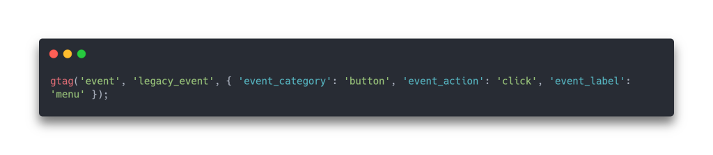
As you can see, consistency and planning are important. If you’re migrating from UA to GA4, now might be a good time to make a fresh start and plan out your new event naming strategy. In the meantime, if time is running out, you may be able to update your analytics code to still send in your old UA events to a new event named legacy_ua_event with event_category, event_action, event_label and value properties.
To actually make good use of your custom parameters in the GA4 interface itself, additional steps are required. Essentially you have to set up every distinct parameter as a custom dimension (for string values) or a custom metric (numerical values). As you are limited to 50 event-scoped custom dimensions in a GA4 property, this is another reason to minimize the number of different parameter names. It’ll also save you time when setting them all up if you have less of them!
However, to make the most of our custom parameters, and unlock greater reporting possibilities, we move on to Step 2!
Step 2. Connect GA4 to BigQuery, and create some powerful SQL Views
A little bit of setup in BigQuery will save time and create more flexibility in the reports we’ll create later
Straight from the horse’s month – “BigQuery is a serverless and cost-effective enterprise data warehouse that works across clouds and scales with your data.”
Or in plain English, it’s just a big cloud hosted database that will store all our GA4 analytics events and let us query them using SQL.
It’s important to note that whilst BigQuery has a free tier (currently 10 GB storage, up to 1 TB queries free per month), you will be charged once these limits are reached, so please consider any pricing implications should you exceed the free tier thresholds.
To set this up, you will need the appropriate admin permissions for GA4 and BigQuery.
To Connect to BigQuery:
- Within the Google Analytics interface, Navigate to Admin
- In “Product Links”, choose BigQuery Links
- Click “Link” to create a BigQuery Link
- Step 1) Choose a BigQuery project you manage (if you need to add a new project, that is outside the scope of this article, Google Search is your friend here)
- Step 2) Decide if you want to exclude any events from going to BigQuery by choosing “Configure data streams and events”
- We recently excluded user_engagement as we were happy to analyze this within GA4 itself
- For Frequency, at least one of Daily or Streaming. Streaming gives you almost real-time data, and is great to enable when initially experimenting with reports, but there are caveats and usage costs when turning it on. You may wish to turn it on at the start to work with up-to-date data, then turn it off when you are happy with the reports you’ve built
- Step 3) Submit, and wait!
It can take a day or so before the data appears in BigQuery, and more importantly, it only starts storing data from the time you connect to BigQuery. There will be no historic GA4 data in place, so if you can, connect to BigQuery before your site goes live to get data from day one.
Check BigQuery periodically (https://console.cloud.google.com/bigquery) until the data has arrived.
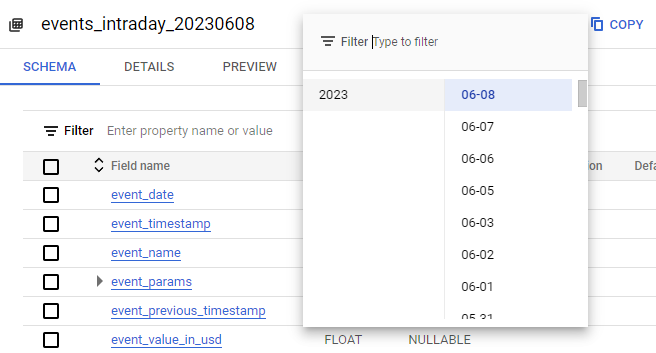
The first interesting thing you will notice is that the analytics data from each day is stored in a separate database table. We obviously want to query more than one day at a time when looking into analytics so we will use some BigQuery SQL to do so.
Daily tables go into tables named events_{year}{month}{day} and Streaming tables go into tables called events_intraday_{year}{month}{day}
We’ll start by explaining how we can query a range of daily or intraday tables as if they were all one big table, and how to limit the data by date.
In BigQuery, in the project you connected your GA4 into, Create a new query. In our example, we did not enable a Daily export, only Streaming, so will query the streaming tables only. You can alter the query to select from events_* if you prefer.
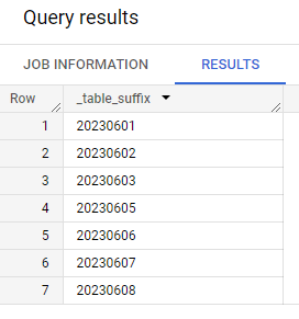
We can select from multiple tables by using the wildcard character (*). The dynamic table suffixes can be referenced through a special column called _table_suffix. Lets see the values of _table_suffix with the following query:

And here’s what we get:
The events_intraday_* will consider all tables that begin with events_intraday_ for selection. In order to limit our results to a range of dates, we use:
_table_suffix BETWEEN format_date(‘%Y%m%d’,date_sub(current_date(), interval 7 day)) and format_date(‘%Y%m%d’, current_date())
Which in our example will look for table suffixes between 20230601 and 20230608.
If you have also enabled the Daily stream and would like to query a combination of intraday and daily tables, you can do the following trick. Bear in mind that intraday tables will update throughout the day and you are best to query only the final daily tables to get the most complete dataset. This is useful for getting an almost real-time view of your data in your reports, and can be handy for monitory daily Key Performance Indicators (KPI’s) throughout the day.
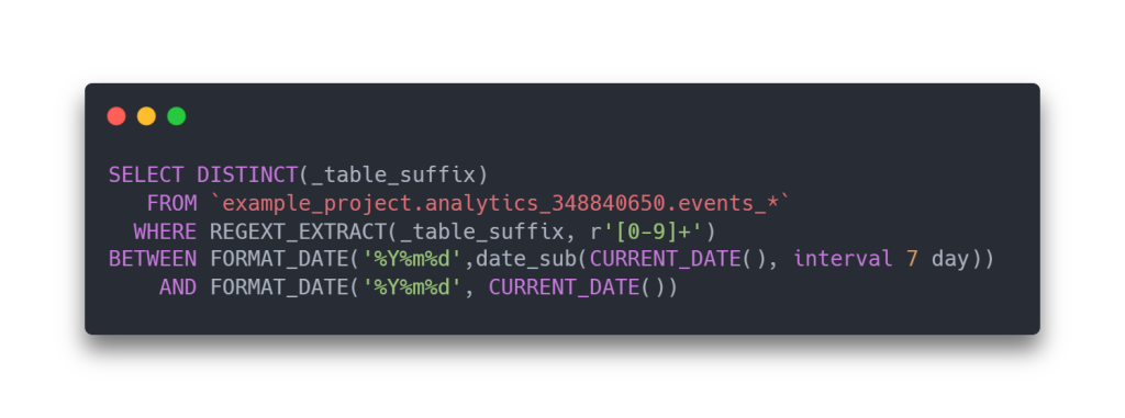
We need to use the regexp_extract as when querying events_* the table suffixes will either look like intraday_20230605 or 20230604, depending on if they are a daily or intraday table. The regexp is extracting the numbers only, allowing the date condition to work across both formats of table prefix.
Now for the fun stuff! First, let’s understand how all the custom event parameters are stored in BigQuery.

In this example, we can see a custom event called poi_page_view, and then a special field called event_params (spread across 5 columns in the screenshot).
Think of it as a table containing all the event parameters for an event, with one row per parameter.
| key | string_value | int value | float value | double value |
| The name of the parameter e.g. title, id, category etc. | Used If the parameter value is a string | Used if the value is a whole number | Used If the value is a large whole number above the range of an integer | Used if the value contains decimal places |
Alternatively, think of it as an array of objects like so:
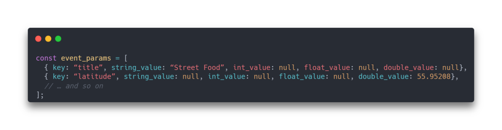
We can already see some useful custom event parameters. This is a page view of a point of business, and amongst other things, we are recording the latitude/longitude, category and database id of the business being viewed. We’ll visualize these on a map later, but first let’s see how to flatten each event parameter and store it in its own field/column.
Say hello to our new friend – UNNEST! It is a specialised SQL function that we will use in collaboration with a sub-SELECT to do just that. It is a bit fiddly to set up for every parameter, but worth it in the end!
Essentially, the UNNEST allows us to SELECT a single row in the table by targeting a specific key (our custom parameter name), then we use AS to give it its own name. We use this opportunity to convert the camelCase property names into snake_case names, for consistency and to make them easier to read.
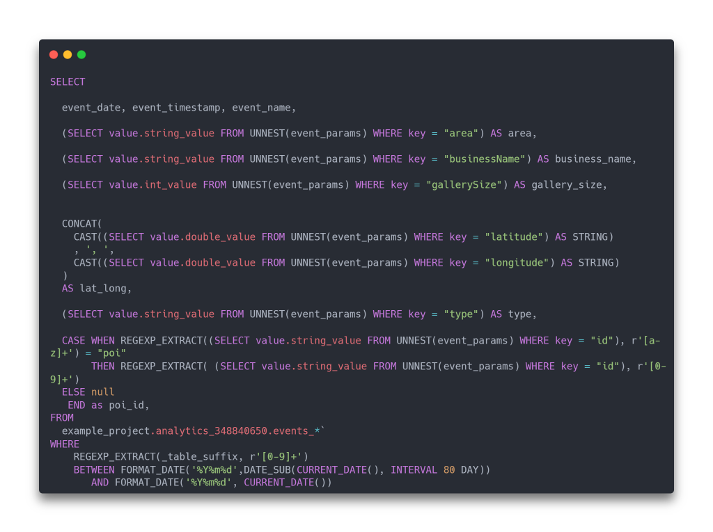
For each parameter, we copy the value from the appropriate string/int/float/double field depending on its data type.
We also do some string wrangling to create a lat_long field – which will come in very handy later! BigQuery is fussy about data types, so we use CAST to convert the latitude and longitude doubles into strings.
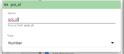
Finally, the case checks to see if the id contains the phrase poi e.g. poi_1225 and if so it populates a new a poi_id field with the value 1225. If the id is not in that format the value of the poi_id field is set to null.
We fetch the last 80 days, which means we fetch enough data to report on last 7 days vs previous 7 days, and last 31 days vs the 31 days before that, with a bit of leeway to give some time to view the reports.
The end result is like so. Every event uses its own subset of the complete set of distinct parameter names, so some columns will be null. This is not an issue as each chart will be making use of only on the parameters associated with the event being reported on.
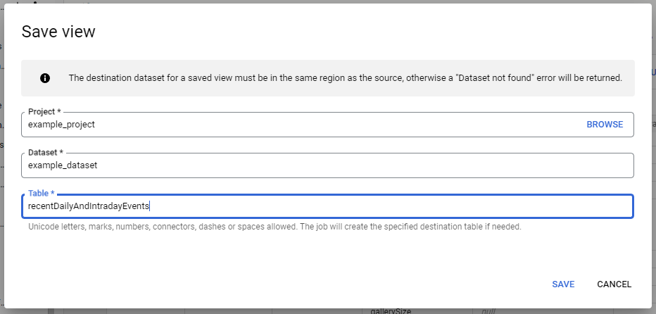
Before we delve into Looker Studio, we will save our new query as a view. Rather than directly connecting the daily/intraday tables from BigQuery into Looker Studio, if we create a view, we can connect to it instead, giving us more control of the data we send. We can link directly into BigQuery, but without the un-nesting, reporting on custom event parameters is a painful experience!
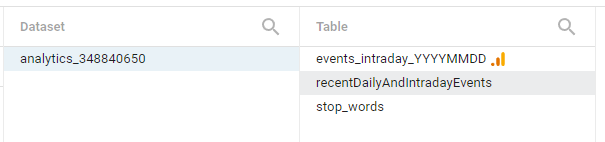
We name it something meaningful e.g. recentDailyAndIntradayEvents so that it’s clear what data it return (We’ve used the generalised word “recent” as we might decide to fetch more or less than 80 days of data in the future)
The idea is to use as few data views as possible in Looker Studio, so that the data can be more easily cached, and items within the report can be drilled down more easily – as all the metrics come from the same source and share the same field names. There are some exceptions though, as by using some SQL Wizardry, we can create some interesting alternate views on the data in BigQuery, which can be useful for more specialist reporting pages!
Step 3. Connect BigQuery into Looker Studio and make our first chart!
We will start to feel the fruits of out labour!
Log into Looker Studio (https://lookerstudio.google.com/) and create a new Blank Report.
It can be useful to first go to File -> Theme and Layout and customise the LAYOUT.
The default canvas size is fairly small (US letter 4:3 landscape) and unless you’re actually planning to print your reports, entering a custom canvas size will give your reports more room to breathe. We like to make them a bit wider and taller. Fear not as you can override the size of individual pages as required.

Next, go to Resource -> Manage added data sources and + ADD A DATA SOURCE

Select BigQuery, then choose your new view.
Once you’ve clicked Add it is a good idea to check that Looker Studio has correctly interpreted the data type of each field.
Head back to: Resource -> Manage added data sources and edit your new data source connection.
Check each of your parameters and choose the appropriate type. Importantly, if you have a latitude/longitude field, be sure to set it to Type: Geo -> Latitude, Longitude

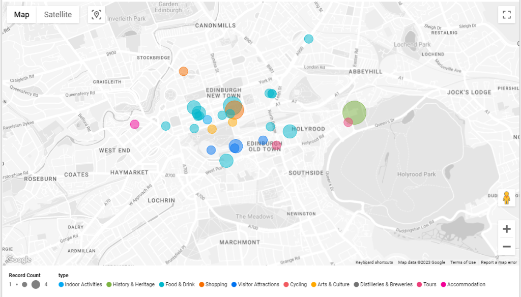
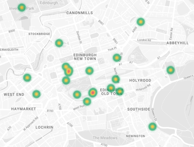
Enough with all this setup, lets add a chart! How about a map that shows the locations of the businesses whose detail page was viewed on the website. The more the views, the bigger the dot. And while we’re at it, let’s colour code each dot by the primary category of the business. Try adding that in GA4 I dare you!
All this is made possible due to the fact we created a custom event called poi_page_view, which included the following custom parameters, amongst others:
- Business name
- Category
- Latitude/Longitude
Start by Adding a Heatmap Map chart: (From menu: Insert -> Heatmap, or use Add a chart dropdown on toolbar.)

When a chart is first added, it makes some default choices of fields for us to change as required.
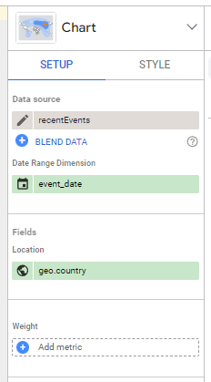
The Date Range dimension is important, as it allows the chart to be filtered down by date. It has correctly chosen the event_date field, so no need to change it.
The key field in this chart is the Location field. It defaulted to city, which is one of the built in GA4 analytics metrics. This is the estimated city of the user accessing the page, which is not what we want. We want the physical location of the Point of Interest (POI) page they were viewing.
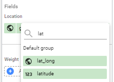
As we recorded it as a custom event parameter, we first change Location to our lat_long field:
If all went to plan, you should see a heatmap of POI locations:
For our chart, we want scaled dots instead, so navigate to the Style tab:
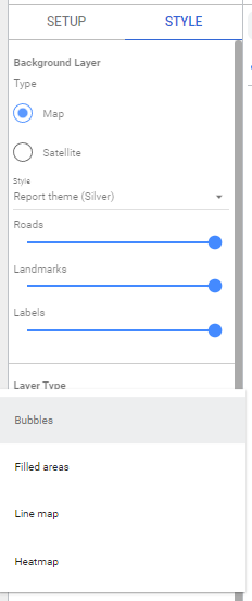
Choose “Bubbles” in the Layer Type dropdown then head back to the Settings Tab.
Before we configure the display of the chart, we need to do something very important.
By default, the chart will use all the data that comes from our data source – in our case the BigQuery view we had with containing every analytics event.
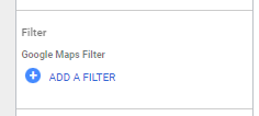
We only want to display entries on the char from our custom poi_page_view event, so we must filter the chart data.
Looker Studio gives us the ability to filter at a few levels:
- Filter at a chart element level: The filter will only apply to the individual chart item itself
- Filter at a group level: If you group a few chart items together, you can apply a filter to all the items in the group
- Filter at a page level: Filters attached to the page will automatically apply to every chart element in the page
When first using Looker Studio, most people filter at a chart level, as it is the most straightforward and obvious way. However, the group and page level filters are extremely useful and we recommend that you consider using them once you get more acquainted with Looker Studio and start building more advanced report pages focussing on individual events or event parameter values.
We’ll start the easy way first, a chart level filter!
In the Chart Settings tab, towards the bottom, click ADD A FILTER
As this is a new report, there won’t be any existing filters, so choose + CREATE A FILTER
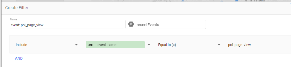
Create a filter to Include: event_name Equal to (=) poi_page_view.
Our chart will now use the correct subset of records, so let’s configure it further:
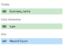
We use the business_name as the tooltip:
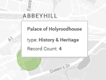
By setting the Color dimension to type, the chart will automatically assign a different colour to each POI type:

For Size, choosing Record Count lets us visually see the most popular POIs. We might also have chosen the count of distinct users viewing the POI – Count Distinct (CTD) user_pseudo_id.
Before we make our report better, we are going to do something very powerful, connect our actual CMS database directly to Looker Studio!
Step 4. Connect Looker Studio directly to the CMS database for a world of possibilities!
Blending information directly from your database gives new levels of flexibility
An event can have up to 25 parameters, with most values needing to be 100 characters or less, which can be quite restrictive.
However, if we know which database record is related with an event, we can blend the data together, and mix analytics recorded with GA4 with information from the live database.
Our example site uses WordPress, where pages are stored in a post table, which has a primary id column, making it easy to cross reference with any GA4 events that store the primary id of their associated post.
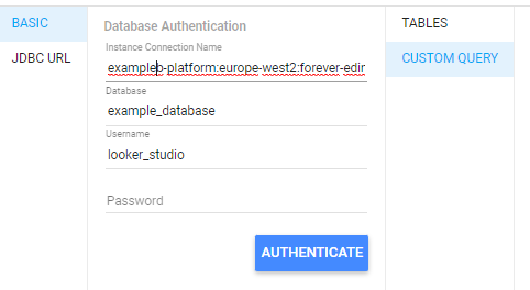
To connect your database, you may need to allow Looker Studio access through your firewall, unless you are using Google Cloud SQL for MySQL. You should also create a new database user that has read only access to only the tables you need for your reports.
Go to Resource -> Manage added data sources and + ADD A DATA SOURCE

Choose the most appropriate SQL Connector for your database, then enter your credentials.
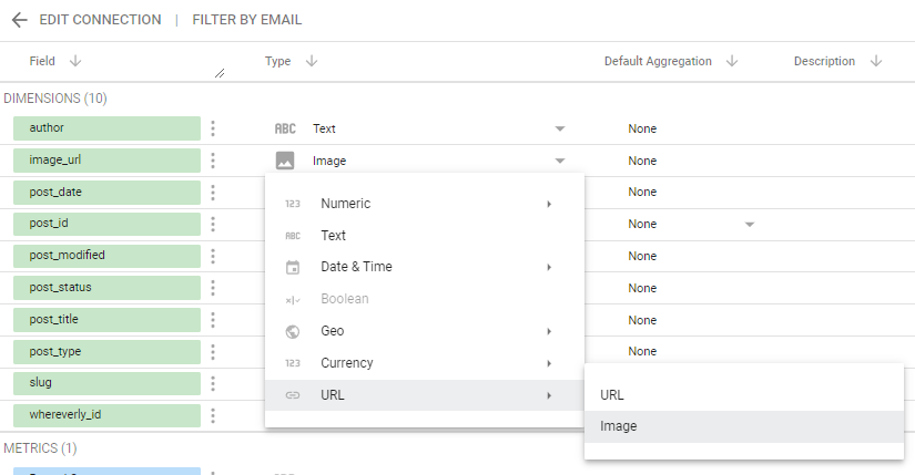
A Custom Query is recommended. Use it to choose only the content required for the report, as well as do some fancy joins! Let’s get our money’s worth and fetch the page’s primary image. We need some fancy jiggery-pokery in our case to get the image’s url.
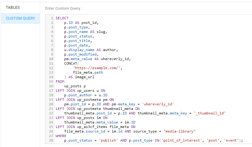
We need to make sure that we set our image_url field to type URL -> Image
Before we do any fancy blends, let’s just add a table chart from our new SQL data source to see our image field in all its glory!
Go to Insert -> Table
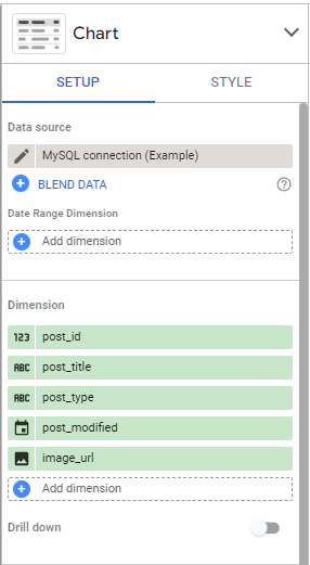
Make sure to pick your new MySQL data source is chosen in Data source, then add a few fields.
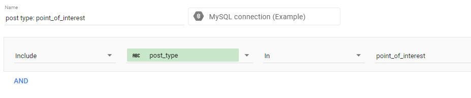
In our example, we want to filter our results to post_type: point_of_interest, so added a chart filter:
The final result is impressive, a direct connection to the CMS database, displaying the Point of Interest’s primary image!

How can we connect this up with our analytics events?
Given that our poi_page_view event has a custom parameter named id, with values like poi303, and our BigQuery view used an UNNEST to extract this value into a field called poi_id, we can match it to a corresponding post_id in the CMS database!
Step 5. Use blends to connect different data sources or chart elements with different filters applied
Blends are a hidden gem that unlock new possibilities, we’re only just scratching the surface in our example
Let’s get blending! The easiest way to make a blend is to add two tables to the report, each with their own fields and filters applied.
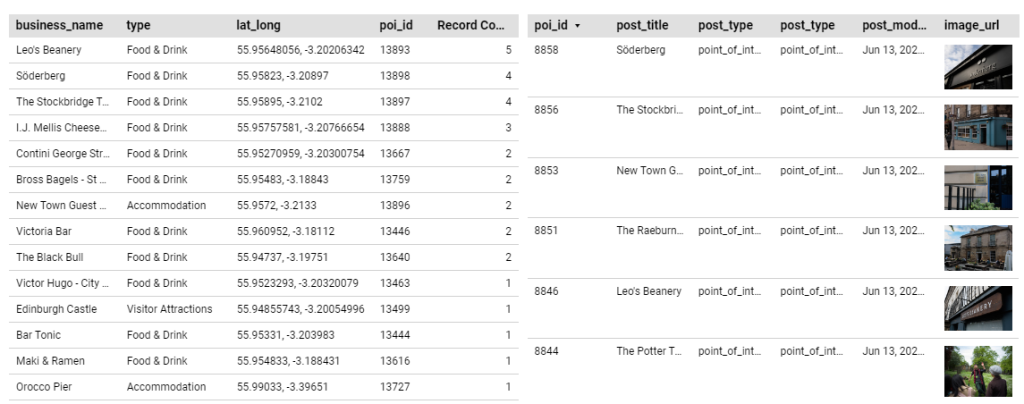
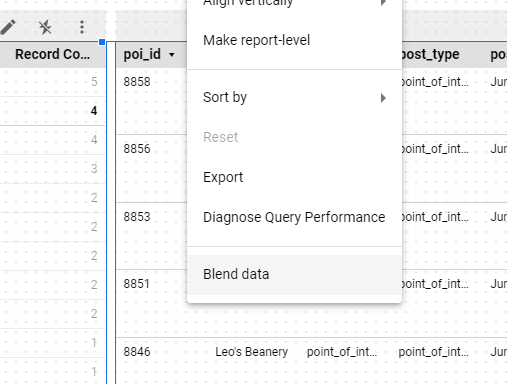
We did something sneaky to make our lives easier. the CMS table actually has a column called post_id, and not poi_id (as it also contains other content types)
Click the pencil on the post_id field (this is not immediately obvious!)

Now rename post_id to poi_id. This will give Looker studio a clue when we blend them together.
Now select the two tables together, either by dragging your mouse across them, or holding down CTRL or the Mac equivalent whilst clicking them.
Press the right mouse button, and in the popup menu, choose “Blend data”
It will create a Blend and add a table. Lets see whats happening under the hood, and give the blend a more friendly name.
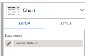
Select the new table chart, and in Data source click the Pencil, to edit the Blend
Click on the 1 condition pencil between the tables
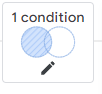
Because we renamed our post_id to poi_id, Looker Studio chose that field to join the tables together, since the field was present in both tables.

Give descriptive names to Table 1, Table 2, and Data source name. The benefit of selecting two tables then blending is that the Dimensions and Metrics are taken automatically from the correctly configured tables, so no further setup is required.

With this blend, both data sources have access to fields that were not in their own dataset. What’s more, you can blend more than two data sources together, or even blend to the same data source with different filters applied to each.
With a little bit of work in Looker Studio, the following report page can be constructed. It’s an interactive report that allows some basic filtering.
The filtering works by configuring Drilldown on the Category table,
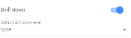
By setting the Default drill level to “type”, when we click on a row in the table, all the other charts containing a “type” column will further filter to only show records matching the selected “type”.
This lets us click on a category, to both filter down the business shown on the map, and the point of interest list.
This could be used to see which parts of a town lacking in particular categories, lets click Accommodation:
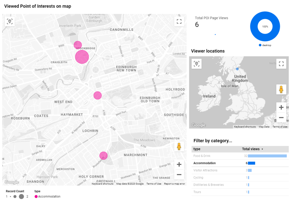
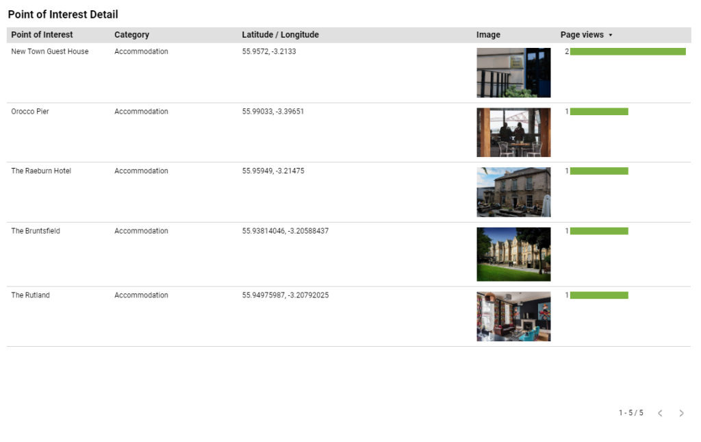
We can now see the coverage of Accommodation Points of Interest on the map, and might use this information to reach out to further businesses to appear on the site.
As our examples are connected to test analytics data, our Page view figures are low, but with live site data, you can add many more chart items to the report to see it come more alive, for example: visualise poi_page_views by country, time of day, specific Android/iPhone models and more. With the ability to blend in data directly from your live database, you can add much richer content to your charts, and display data that’s hard or impossible to capture within the event parameters themselves.
The best way to learn Looker Studio is to experiment with all the chart types, and look around the user interface. What are you waiting for? Get stuck in and find new inventive ways of using events and CMS data in your reports!
Masthead Photo by Carlos Muza on Unsplash